tentree
IMproving the eCommerce experienceBackground
tentree is a fast growing eco-friendly apparel startup. Sold in stores like REI, tentree appeals to “environmental-ish” customers — people who want environmentally conscious apparel, but not at the expense of fit and style.
tentree's overarching problem was unused capacity:
- Their website had beautiful design and product photography, due to talented in-house art direction. And while it sold well enough in spite of being unoptimized, there was a lot of room for improvement
- There was no in-house conversion rate optimization work being done. They were essentially coasting on traffic created created by social media
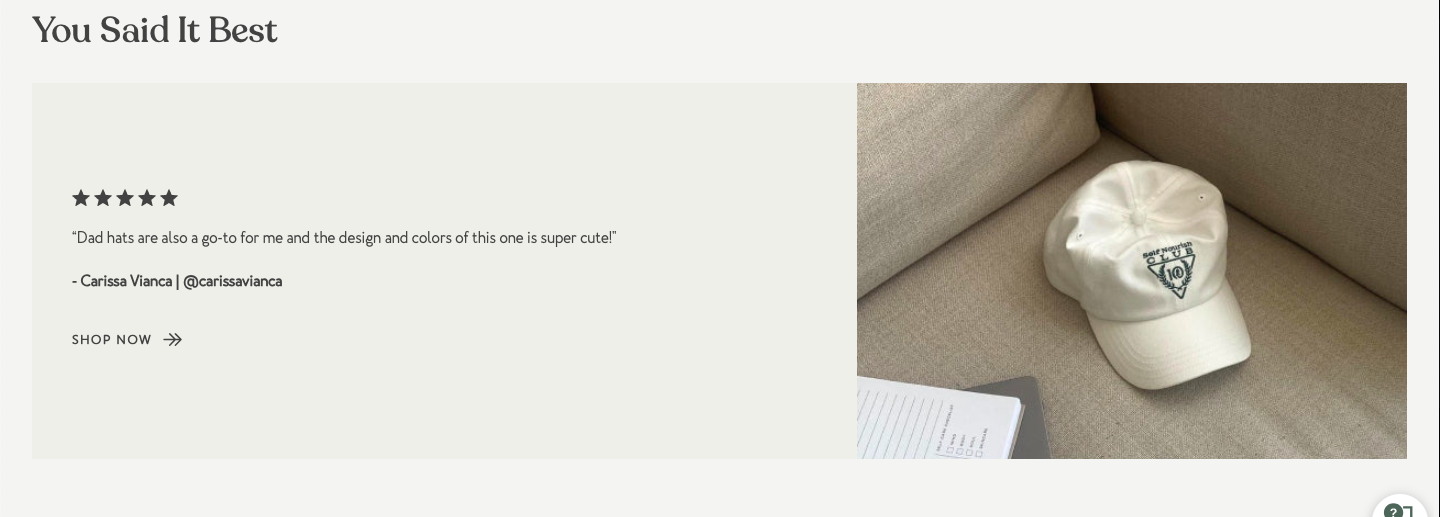
- Credibility indicators such as customer photography on social, 5-star reviews, and press acclaim were abundant, but were not integrated into the user experience
- Their blog received millions of uniques from search, but the traffic was not translating into sales, to the point where they were considering shutting it down
Goals
The marching orders for my consulting engagement project were the following:
- Look for "deep optimizations:" opportunities to integrate strategic differentiators and unfair advantages in a way that clearly sets them apart from competitors
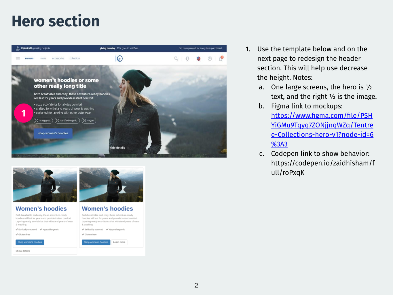
- Improve the shopping experience: meet-or-beat competitors such as Patagonia, North Face, and Prana. Operationally, that meant redesigns for:
- The Home page (especially above-the-fold, where positioning content should be)
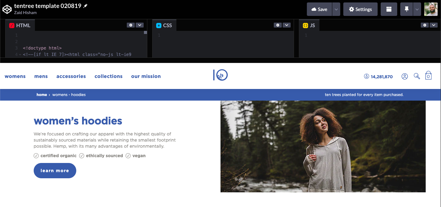
- Product pages (i.e Elevation Men's Loose fit pullover hoodie)
- Clothing type category pages (Men's hoodies)
- Fiber type category pages (e.g. hemp, organic cotton)
- Blog
- Increase conversion and revenue using the blog and social media traffic
- Increase email signs-ups: capture subscribers coming from organic traffic that are not ready to buy yet
Approach
Improve the shopping experience
I start all consulting engagements with an eCommerce UX best practices audit. Being trained in the deep end at Expedia — designing A/B tests for the Hotels vertical — I have developed an eye for anything that is not performant, accessible, responsive, and on-brand.
The other aspect of an audit is to plug the holes created by the development platform. tentree used a Shopify template, without being aware that Shopify "ships broken.” While the templates look great, many do not don't conform to eCommerce best practices. This impacts conversion.
The most efficient way to design for eCommerce is to start mobile-up, so I used Bootstrap, hand-coded CSS (to emulate tentree’s design), and Codepen to do the redesign. Seeing breakpoint transitions helped me make better choices about layout, interactions, visual design, and content.
Increased revenue from blog
User were landing on the blog from search without being given the opportunity to learn about tentree and to actually shop for apparel. We used heat mapping to view how first-time blog visitors were interacting with the site. Exit surveys revealed that most site visitors weren't even aware that tentree sold apparel, and instead thought they were only an eco-news blog. We designed a new blog that tied blog topics to product categories and featured related products. For example, we used blog posts about plastic pollution to showcase products made with recycled polyester from used water bottles.
Finding the "Deep optimization"
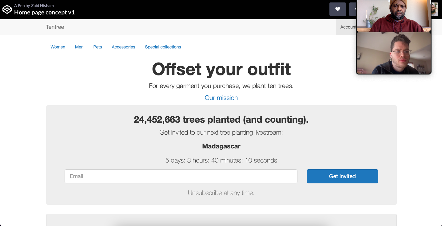
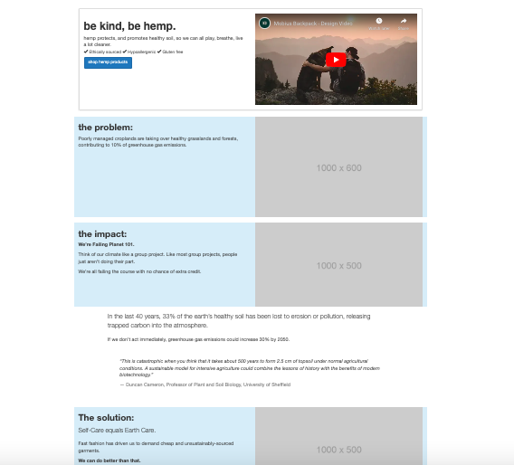
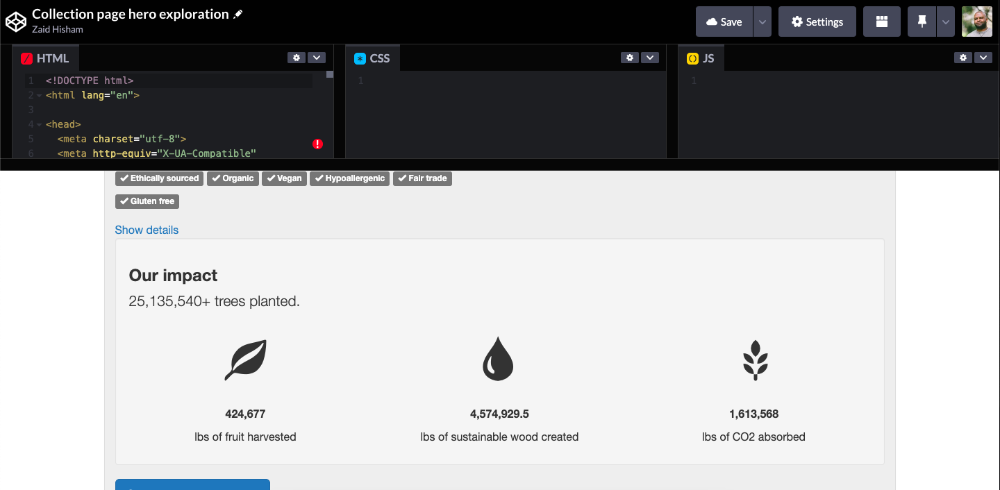
tentree's main value proposition is that every product purchase results in ten trees being planted.
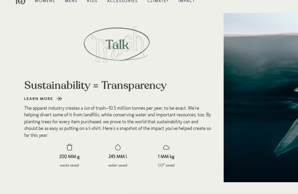
tentree had a great story and value proposition, but they were not integrating it into their user experience in a way that enrolled shoppers into their mission. Many amazing benefits and details about the impact of their tree planting on the environment were hidden on the About page, even thought it was a big part of what differentiated them from competitors like Patagonia, The North Face and Prana.
I designed a home page that led with the impact of tentree's tree planting to incentivize shopping and to enroll users in the cause before they even bought anything. I also designed various website widgets to gamify tree planting, using:
- Social media activity
- On-site quizzes with points translating to trees
- "Tree scores" on each clothing item and in checkout
- Creating a “Forest” milestones based on purchase history
- GPS data so users could find where in the world their trees were planted
- Gifting tree planting just for subscribing to the email list
Increase email sign-ups
We added brand-related modules to every page — who we are, mission and vision, and a newsletter sign-up box — to inform shopper and capture subscribers. The idea here was to give users everything they needed to enroll themselves in tentree's mission, from wherever they landed from search.
Concept for home page hero. If the reason for tentree's existence is tree planting, it makes sense to show users the number, front-and-center. Users like progress indicators and feeling like they are a part of something big. This would have been a live updating number. Psychologically, this gives them a reason come back to the site. I also borrowed an idea from Charity Water: to turn tree planting into an event that users could "register" to view live. The ultimate lead magnet.
Always be adding people to your email list.
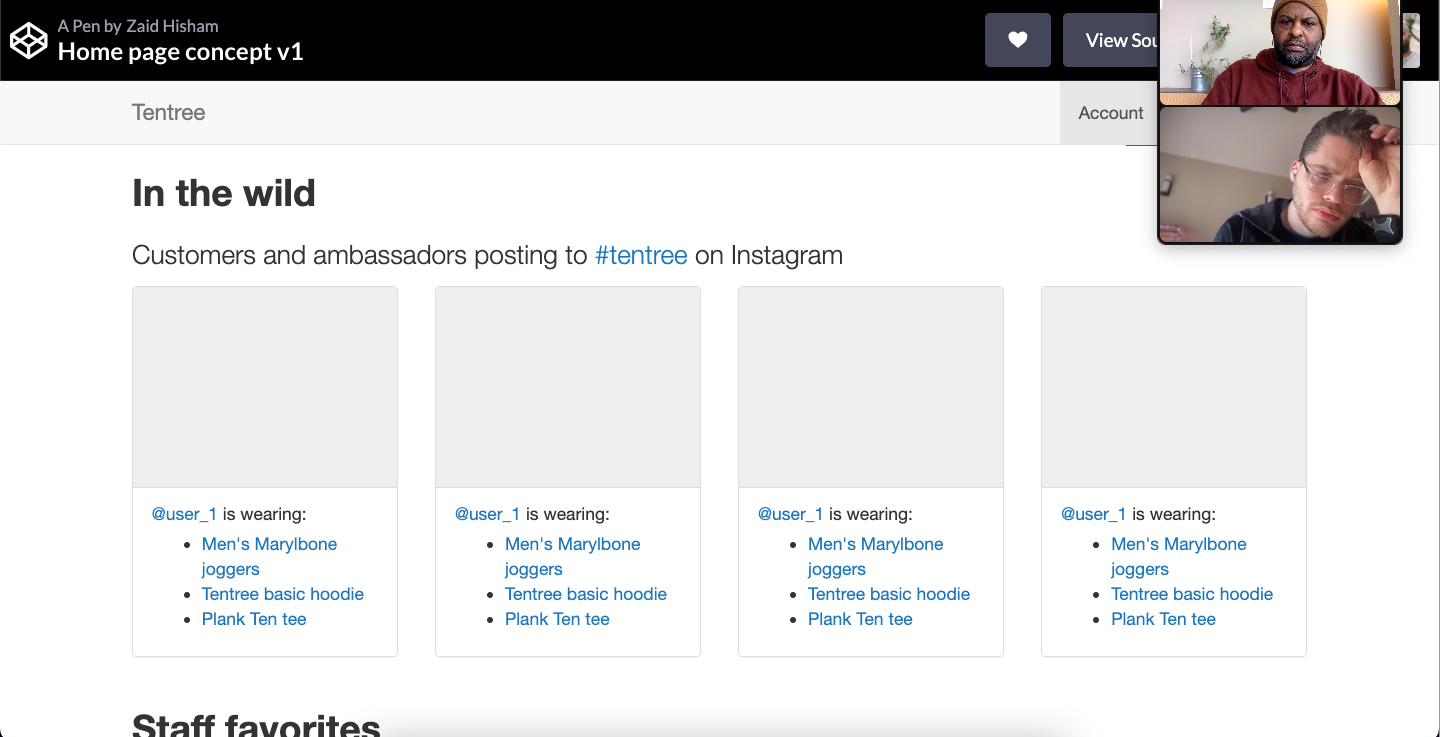
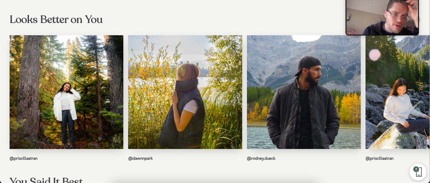
User generated content: Using Instagram images to show that real people buy tentree's products helps user see themselves in the Instagrammers in size, fit and aspiration. It's also a way of borrowing credibility from influencers. This also distances tentree from business that are essentially drop-shipping sites.
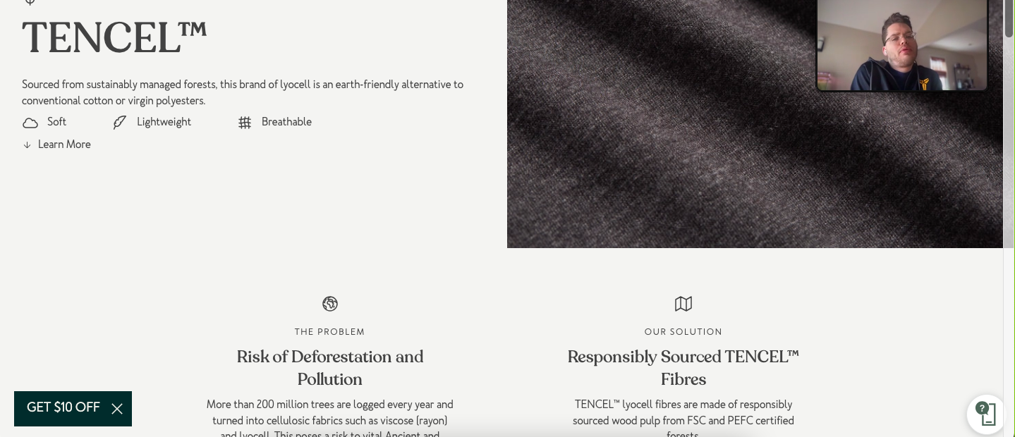
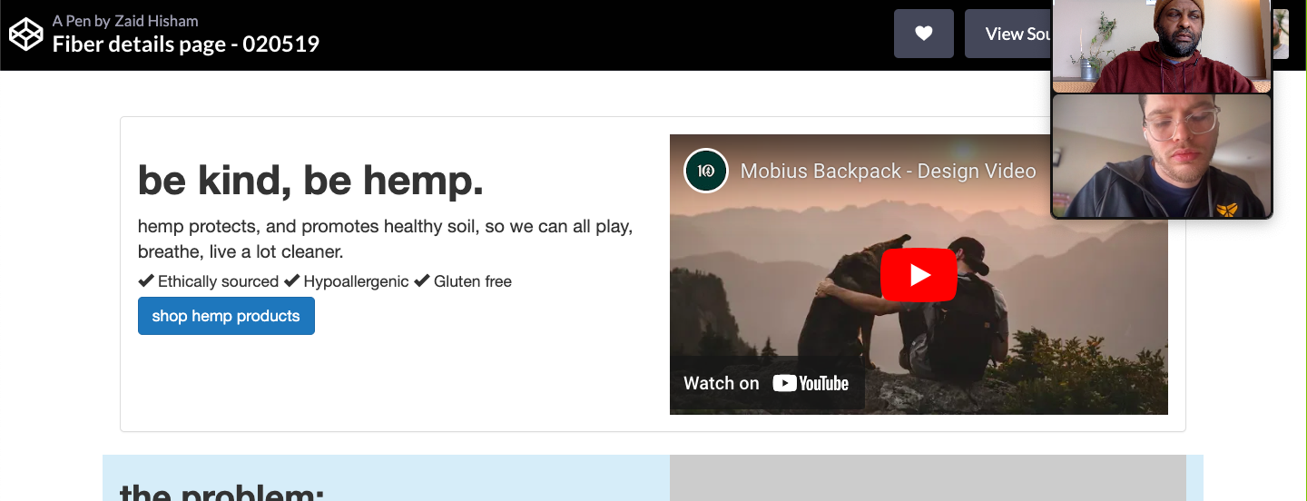
tentree had seven eco-friendly materials they used in their clothing. The founders and their product development team were meticulous in the research and sourcing of these materials in order to be as sustainable as possible. All of this time, effort, and the amazing benefits of using these fibers were not being communicated to shoppers.
I designed a fiber page template that could be used across all seven fibers, that displayed the benefits along with a call to action to shop above-the-fold. The fiber pages served as further reading (i.e "Learn more about hemp") links available from the product details sections of product using that fiber, with the goal of making the customer journey more holistic.
Always be selling.
Challenges and solutions
I was contracted by fractional CMO Joshua Boone for a 3-month project, so the challenge was to impart as much value as possible in a short time frame. The main challenges were:
- Remote: Team was in Vancouver, British Columbia; I was in Portland, Oregon
- Limited in-house capabilities: Two-person dev team with no eCommerce or conversion rate optimization experience
- The dev team's time was limited by other responsibilities they were limited in scope in regards to what they were able to handle in-house
I created several workarounds, including:
- Dispensing with detailed visual design and focusing on creating wireframes that were easy to implement at the template level, even on limited dev resources
- Using Codepen, so the dev team could see how the responsive elements worked
- Running Zoom hand-off meetings where I would explain my design choices and how they enhance the eCommerce experience
Outcome
My design suggestions and templates resulted in more revenue and email sign-ups, reduced bounce rate, and longer time spent shopping. This lifted the conversion rate and resulted in millions of dollars in additional revenue.
Years later, tentree is still referencing and incorporating my work.
My assets were handed off to and utilized by a design agency during tentree's next big redesign to incorporate elements that the internal team didn't have the resources to implement.