Expedia
Weather advice in hotel search resultsBackground
Expedia wants to provide value across the customer’s entire trip and go beyond selling hotel rooms and flights. We want to help customers plan their trip, research locales and activities, and assist them while they’re traveling.
When customers are looking for new experiences, they may not know the best times of the year and locations to travel to get the best weather conditions. How can we help them make better decisions by messaging weather advice without interrupting their search?
Approach
I led brainstorming sessions with a content strategist and the web developer and discussed the following:
- Exactly what job should this feature do for customers?
- How should the messaging be crafted in a way that is clear from mobile up to desktop
- Where should that messaging live in the screen?
- What user activity and criteria trigger the interaction?
Our A/B tests for a design had constraints such as:
- Mobile-up responsive
- A/B test variants isolated along one vector (content, interaction, or UI)
- Connected visually with our UI toolkit
- Accounts for localization
- Considers the content strategy guidelines
Design exploration
Conclusions from the brainstorming sessions were:
- Interaction is only triggered for customers searching for traditional beach and skis locations
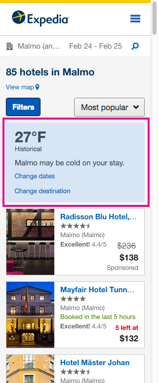
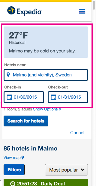
- Messaging should live in the search area since it's like a search "error".
- Technically, we could grab information historical weather data and compare it to data connected to customers' locations and date choices
- UI element should allow search results to maintain their "peek" above the fold on mobile
My design exploration included:
- Creating new icons
- Testing ways to show prominence (e.g. iconography, temperature data, plain language)
- Testing across breakpoints
As is the case with most A/B tests with many constraints, the final design relied on copy.
Results
The resulting design satisfies all of our technical, content strategy, and UI constraints. The learning goals for the A/B tests were the following:
- Is playing the weather conditions along with the open search box enough to elicit new search behavior?
- When customers do try new searches, do they prefer to try to locations or date ranges?
