Xbox One
Closing gaps in wayfindingProblem
The Xbox storefront used duplicate and similar artwork for tiles that linked to different places, making it hard for customers to find the content they were seeking.
Challenges
Unlike the web — where text links indicate the target destination — the Xbox UI model relies on a movie-poster style visual experience like Netflix or Spotify, but without persistent text labels. This creates work for the user and wastes their time, as they must now guess their target destination.
The main organizational constraint was that there were no guidelines for content providers to ensure they provided unique artwork for each type of destination.
My solution needed to account for the fact that we had no control over tile artwork.
Approach
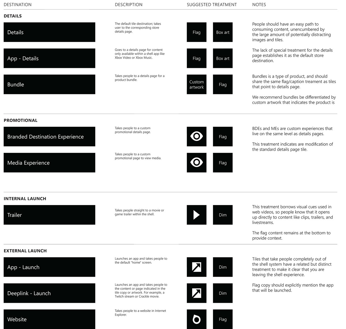
I consulted with product management, and discovered that there were nine different destinations that users could possibly go.
I analyzed the destinations and organized them into broad categories, such as:
- Details pages
- Promotional
- Internal and External app launches
solutions
I created a list of broad categories with visual treatments. This helped users find their way around the Xbox One store and get to the content they were looking for faster.
Portfolio

tentree

Leviton

Fiserv

Revelation Global
Xbox

Expedia